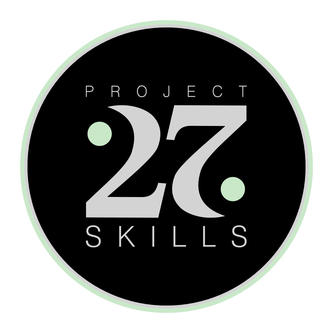
Everyone needs a logo, right? So we designed one.

The design of the logo
Danielle took the lead on the design work, and we had a bit of family help too. To start with, we sketched out 20 or more ideas. Some were rounded, some looked like an award, and some were wild. We loved them all.
Nevertheless, we managed to narrow down our favourites to only three types of design. At the end, a circular design won. This tends to work better with social media platforms, and looks great.
Daniel’s aunt, who is a graphic designer helped flesh out a few more details, and a tonne of variations. That’s how we ended up with rings around the central disc, and two additional discs on the diagonal of the 27 label in the middle. The cool thing about 27, and the font design we chose is that it looks the same, even if you look at it up-side-down.
The colour choices were coming straight from the colours we already used on our website.
As a bonus, we also came up with a banner. This spells out the project tagline; “Skills that matter”. The parallelogram shape in front of the tagline is a shape that hints at the number 27. Just think about the shape of 7, and now look at the top-right corner of the shape… Striking, isn’t it? Ohh, wait, we are not showing the banner here just yet. Watch out, we will be introducing the logo and the banner on our YouTube channel next month. Stay tuned.
Previous: Making space for video content
Next: Responsive iframe - An easy bug fix
This is an open source website. Please, help improve the content on this page.

